Visualizing the Spatial–Temporal "Danger Zone" of Aviation Bird Strikes
An interactive data visualization exploring the intersection of human air travel and natural bird migration — revealing where and when aircraft are most at risk of encountering wildlife.
Explore VisualizationsBird strikes pose real economic and safety threats to aviation, causing significant repair costs and operational disruptions every year.
By overlaying strike incidents with migratory corridors we identify risk hotspots at specific airports, altitudes, and seasons.
Our multi-dimensional visualization lets users explore several aspects of the dataset within a single, cohesive interface.
288 810 incidents · 110 columns · FAA data from 1990 – 2023
Covers species, aircraft type, flight phase, location, flight speed and altitude, weather conditions, and economic damage — making it one of the most comprehensive wildlife-strike records available.
View on Kaggle →42 844 records · 26 columns · GPS telemetry from 1993 – 2023
Provides directional migration routes with full taxonomic classifications and IUCN conservation status, enabling direct comparison with FAA incident locations.
View on figshare →Key findings from our preliminary analysis of both datasets. Full notebook available on Google Colab.

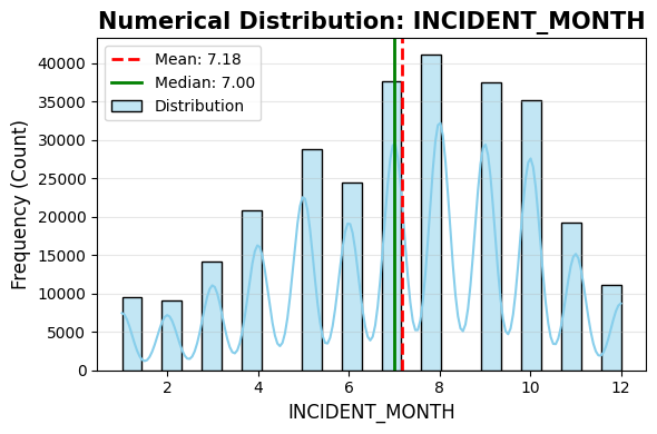
A clear seasonal peak in summer months — coinciding with the main bird-migration windows.

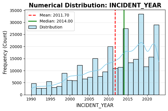
A steady upward trend in reported strikes over the 33-year period, reflecting both increased reporting and air traffic growth.

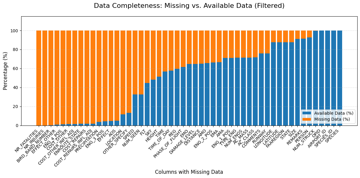
Cost and fatality columns are largely empty; weather and coordinate fields have ~10 % gaps requiring targeted imputation.

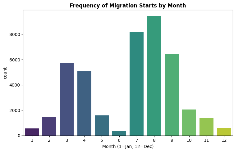
A bimodal pattern: the primary surge in late summer (July–September) and a secondary spring peak (March–April).
Our final interactive dashboard will combine these three core components into a single, cohesive interface.
An interactive map overlaying FAA strike locations with global bird migration corridors, highlighting geographic risk zones near airports.
Coming – Milestone 3Time-series and heatmap views revealing how strike frequency and severity shift across months, years, flight phases, and altitude bands.
Coming – Milestone 3An annotated aircraft schematic showing which components are most frequently struck and under what flight conditions damage occurs.
Coming – Milestone 3We will use this layout skeleton to position our final visualizations, which will be rendered interactively using D3.js. Each placeholder will be replaced with a fully functional plot in the final version.
Not yet implemented. Try Airplane instead.
SCIPER 424398
SCIPER 330169
SCIPER 423634
Data Visualization (COM-480) · EPFL · 2026